

Hotel Booking Case Study
Project Description
The process of booking a hotel often sets the tone for a traveler’s overall experience, yet many existing platforms fail to provide a seamless, user-centered journey. A frustrating or overly complex booking experience can not only deter potential customers but also negatively affect how they perceive a brand.
For this project, I designed a responsive hotel booking website aimed at simplifying essential tasks—searching for hotels, comparing options, and completing bookings—while addressing common user pain points. Grounded in UX as a problem-solving discipline, I began with comprehensive research to uncover user expectations and frustrations. Using methods like competitive benchmarking, user surveys, and usability testing, I translated insights into a user-friendly prototype that removes friction and elevates the booking experience.
01
Client
UX DESIGN INSTITUTE
02
Project Year
Apr 2024 – Nov 2024
03
My Role
UX Designer
04
UI Mentor
Mustafa Al Alawad
PROJECT TOOLS


DESIGN PROCESS
Research
My research focused on understanding users’ needs, behaviors, and expectations to create a user-centered experience. By gathering feedback I identified key pain points and opportunities for improvement. This foundational research provided clarity on industry standards and helped validate design decisions.
Competitive Benchmarking
Online Survey
Usability Testing
Analysis
I transformed raw data into actionable insights, creating a clear roadmap for the design process. This step allowed me to prioritize features and solutions that aligned with user goals and business objectives, setting the stage for an effective and focused design strategy.
Affinity Diagram
Customer Journey Map
Flow Diagram
Design
With a user-centric mindset, I translated insights from research and analysis into tangible design solutions. Each iteration was crafted to be intuitive, aesthetically pleasing, and aligned with user expectations. The designs were then refined for testing, ensuring they were ready for user validation and feedback.
Wireframing
Prototyping
Annotations
Competitive Benchmarking
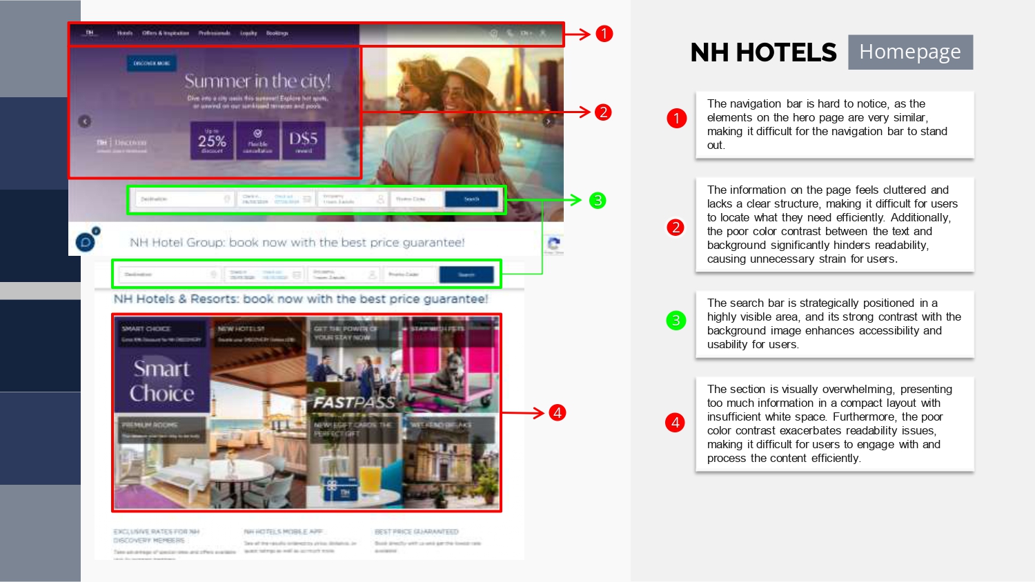
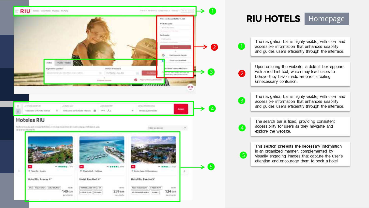
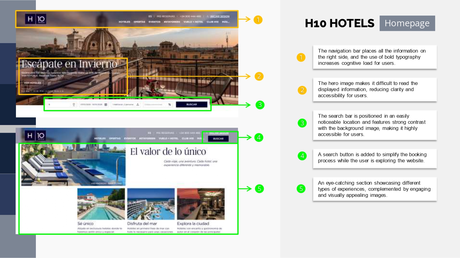
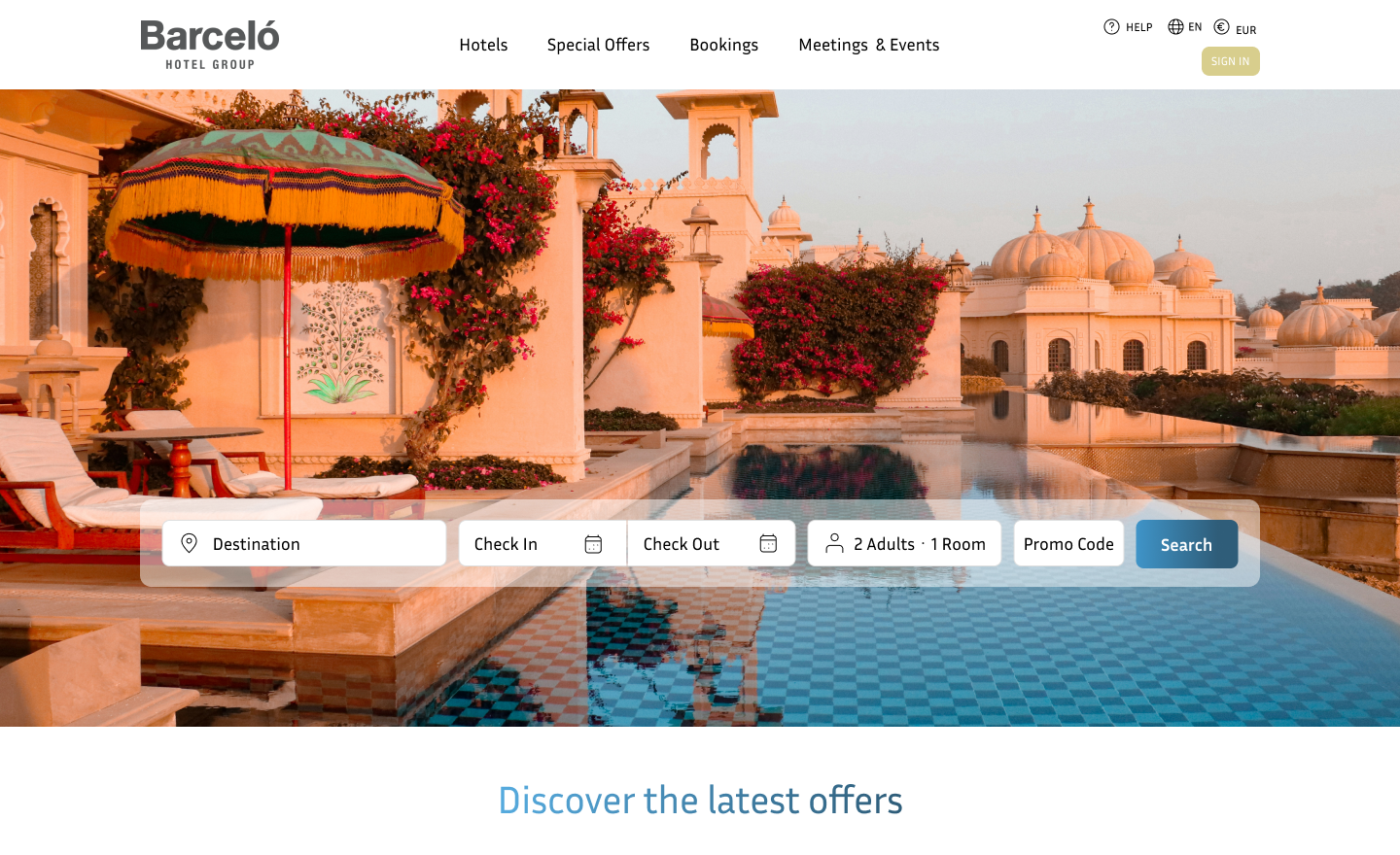
Analyzing competitors is essential for identifying industry conventions, innovations, and opportunities for improvement. For this project, I reviewed four hotel booking websites: NH Hotels, H10 Hotels, Mandarin Oriental Hotels, and Riu Hotels. The analysis focused on key aspects like homepage design, search and selection flows, booking details, and overall performance. This comparison revealed strengths to emulate, gaps to address, and best practices to integrate into my design solution.
Navegation Visibility
The navigation bar is easy to locate and use, but some design choices, like bold typography, can increase cognitive load. Improving visual balance could enhance usability.
Clarity in Room Information
Room details are often cluttered and lack sufficient descriptions or images, making it difficult for users to evaluate options. Organizing content and adding visuals would improve clarity.
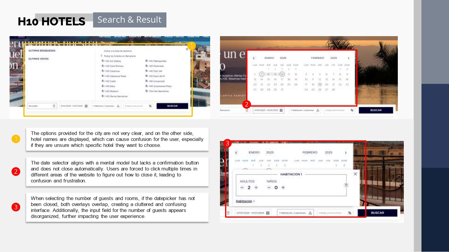
Intuitive Date Selection
The date selector aligns with user expectations but lacks a confirmation button and proper closing behavior, leading to potential errors. Adding these features would streamline the process.
Pricing Transparency
The price breakdown provides valuable cost clarity, but it should be more prominently displayed to ensure users can quickly understand their total expense.
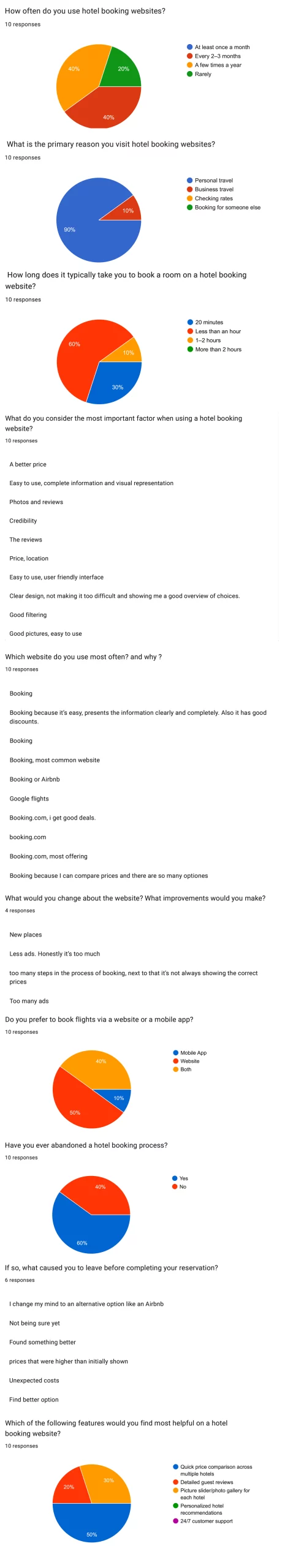
Online Survey
To gain deeper insights into user behaviors, goals, and experiences, I conducted an online survey with 10 participants, gathering both qualitative and quantitative data. The survey questions were carefully designed to avoid bias and align with research best practices. Open-ended qualitative questions allowed participants to share authentic perspectives without being influenced by assumptions or leading language. This approach ensured more accurate and actionable insights, serving as a foundation for understanding user needs and informing design decisions.
Booking Platform Preference
Key Decision Factors
The most important factors for users when booking hotels are price and credibility, followed by photos and reviews. Users also value easy-to-use interfaces and clear visual representation.
Booking Abandonment
Desired Features
Usability Test
1. High-quality pictures are essential for decision-making. Photos of rooms and amenities boost confidence and help users make informed choices.
2. Clearly naming and differentiating room options is crucial. Users need concise descriptions to compare and select the best fit.
3. Filters, especially by price, are vital for simplifying searches. Users value intuitive tools to narrow down their options.
4. User reviews play a key role in building trust. Accessible feedback validates choices and provides social proof.
5. A functional map feature helps users understand the location. Interactive maps with nearby attractions enhance the experience.
6. Transparent pricing avoids confusion. Clear cost breakdowns foster trust and improve user satisfaction.
ANALYSIS
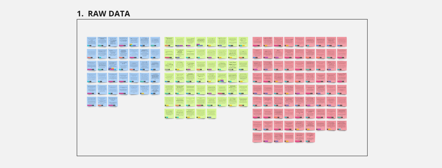
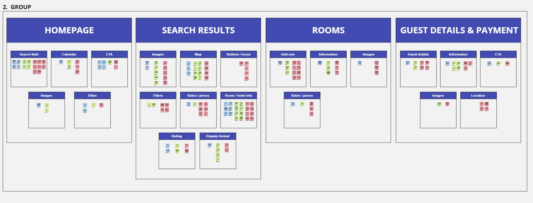
Affinity Diagram
To analyze the data, I used the affinity diagram method to organize and synthesize findings from competitive benchmarking, online surveys, and the usability test. The data was grouped into broader themes such as homepage, search results, rooms, and payment and details.
This method helped uncover patterns in user behavior and highlight areas for improvement, ensuring the insights were actionable and informed the design process effectively.
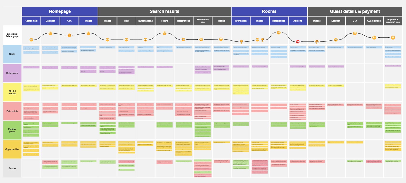
Customer Journey Map
To transform research insights into a comprehensive view of the user experience, I developed a customer journey map that visually represents users’ emotional journeys while interacting with hotel booking websites. The map was divided into detailed steps, capturing user goals, behaviors, and emotions at each stage, from visiting the homepage to completing payment. By analyzing positives, negatives, and mental models for each step, I identified key pain points and opportunities for improvement. One notable observation was a decline in user satisfaction during the room selection stage, where unclear information and low-quality pictures created insecurity about the booking process. Adding user quotes to the map provided further depth and ensured the user’s voice remained central to the analysis.
Flow Diagram
To analyze the data, I used the affinity diagram method to organize and synthesize findings from competitive benchmarking, online surveys, and the usability test. The data was grouped into broader themes such as homepage, search results, rooms, and payment and details. Within these themes, smaller clusters like search fields, images, information detail, and rates/prices were identified.
This method helped uncover patterns in user behavior and highlight areas for improvement, ensuring the insights were actionable and informed the design process effectively.

DESIGN
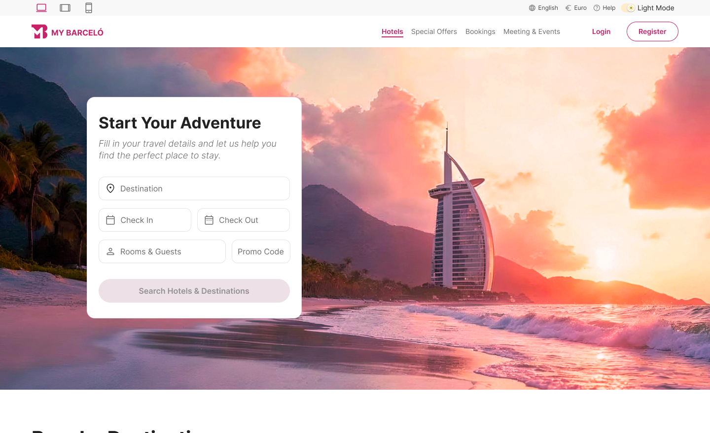
Prototype
I developed a mid-fidelity prototype to provide a realistic feel for the booking process and ensure a seamless user experience. This prototype went through several iterations, incorporating feedback to refine the design and address pain points identified during user testing. The focus was on creating an intuitive flow for tasks like searching for rooms, comparing options, and completing bookings while maintaining clarity and usability.
Want to explore the user journey?
Scroll down to interact with the prototype and experience the design in action!
Before: In the initial prototype, I focused on the basic functionality and structure. However, it lacked the design refinements necessary to enhance the user experience. The visual hierarchy and interactive elements were still in the early stages, leaving room for improvement in both clarity and user flow.
After: After completing a UI design course, I created a design system that allowed me to establish consistent patterns, typography, and color schemes. This helped me craft a cleaner, more cohesive interface, improving both the aesthetic appeal and usability. The design system ensured a smoother user experience by creating intuitive, repeatable elements that enhanced the overall flow and interaction.
Welcome to your next getaway!
Ready to book your dream stay? Step into my interactive hotel booking prototype and explore the process like you’re reserving your next escape. Click through, try out the features, and get a feel for the smooth, user-friendly flow that makes booking a breeze.
Want a different vibe? Switch to dark mode for a more relaxed experience, or go full screen to immerse yourself in the design. Just click the expand button (the arrow next to the mode toggle) to enjoy the prototype in its full glory.